
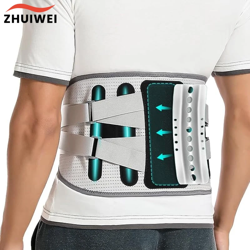
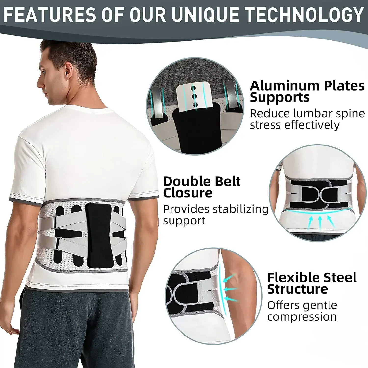
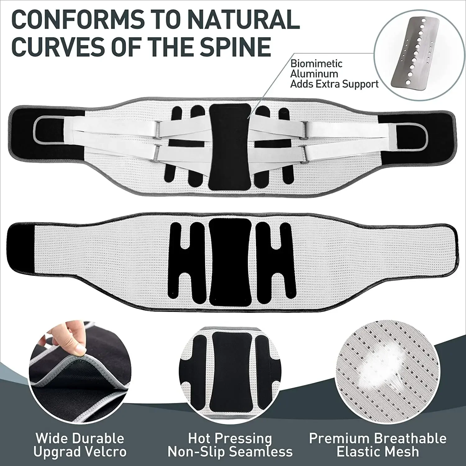
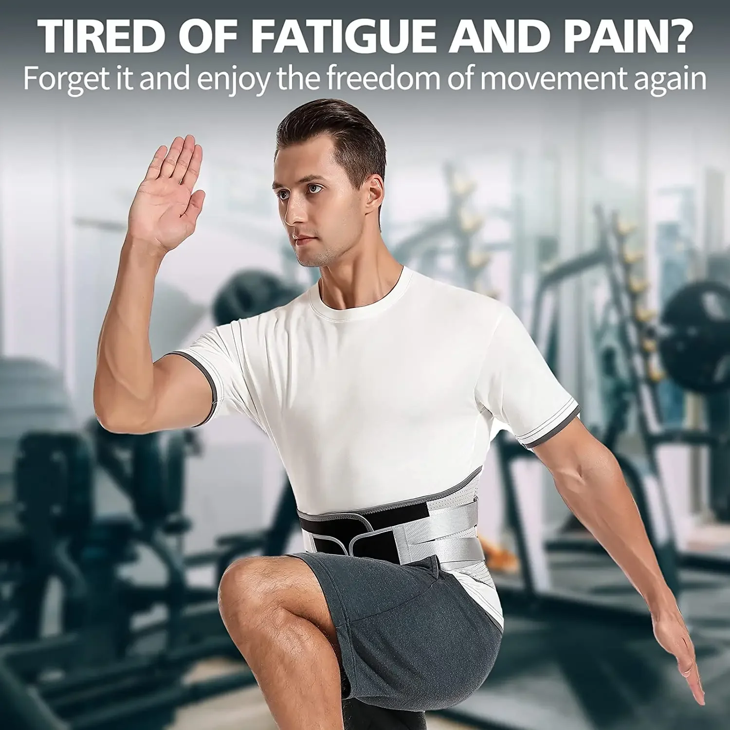
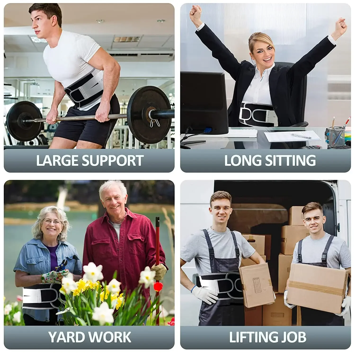
2 SETS REMOVABLE SUPPORT: Back brace comes with removable bionic spine supports and you can freely choose to insert steel support or ABS support to meet your different needs. Extra stability from 2 flexible steel supports along the waist side cooperates with large area aluminum supports on the back that fasts lower back pain relief, back strains, arthritis, relieve sore and aching backs/muscles, forget the pain from a herniated disc, sciatica, scoliosis and help maintain posture correct.
PREMIUM BREATHABLE FABRIC: You want to be as comfortable as possible, especially if you sweat a lot in sports where you know precisely what it feels like to wear non-breathable fabrics and you can try breathable fabrics with eyelets. Breathable, lightweight, and washable quality materials that the back braces for lower back pain use are made, back support belt is comfortable and not sultry even when weight workout, golf, running, losing weight, and all kinds of exercises.
ADSORBED IN YOUR ABDOMEN: Back brace for lower back with double-layer design considerable stability on your abdomen and the adjustable compression strap of the posture corrector provides proper fit and minimizes the sliding(Wearing method can refer to the video to avoid wearing it backward). The back support belt allows you to walk, sit, bend or stretch, without worrying about pain or discomfort and enjoy the freedom of movement again!


position: relative;
}
.aplus-v2 .premium-aplus-module-2 .premium-intro-wrapper {
position: absolute;
width: 50%;
height: 100%;
top: 0;
}
.aplus-v2 .premium-aplus-module-2 .premium-intro-wrapper.right {
left: 50%;
}
html[dir=”rtl”] .aplus-v2 .premium-aplus-module-2 .premium-intro-wrapper.right {
left: auto;
right: 50%;
}
.aplus-v2 .premium-aplus-module-2 .premium-intro-wrapper.secondary-color {
color: #fff;
}
.aplus-v2 .premium-aplus-module-2 .premium-intro-background {
padding: 20px;
}
.aplus-v2 .premium-aplus-module-2 .aplus-module-2-topic {
padding-bottom: 10px;
}
.aplus-v2 .premium-aplus-module-2 .aplus-module-2-heading {
padding-bottom: 20px;
}
.aplus-v2 .premium-aplus-module-2 .aplus-module-2-description {
line-height: 1.5em;
}
.aplus-v2 .premium-aplus-module-2 .premium-intro-background.white-background {
background: rgba(255,255,255,0.5);
}
.aplus-v2 .premium-aplus-module-2 .premium-intro-background.black-background {
background: rgba(0,0,0,0.5);
}
.aplus-v2 .premium-aplus-module-2 .premium-intro-background.black-background,
.aplus-v2 .premium-aplus-module-2 .premium-intro-background.black-background h1,
.aplus-v2 .premium-aplus-module-2 .premium-intro-background.black-background h5,
.aplus-v2 .premium-aplus-module-2 .premium-intro-background.black-background ol,
.aplus-v2 .premium-aplus-module-2 .premium-intro-background.black-background ul,
.aplus-v2 .premium-aplus-module-2 .premium-intro-background.black-background ol .a-list-item,
.aplus-v2 .premium-aplus-module-2 .premium-intro-background.black-background ul .a-list-item {
color: #fff;
}
.aplus-v2 .premium-aplus-module-2 .premium-intro-content-container {
display: table;
height: 100%;
}
.aplus-v2 .premium-aplus-module-2 .premium-intro-wrapper.left .premium-intro-content-container {
padding-left: 40px;
}
html[dir=”rtl”] .aplus-v2 .premium-aplus-module-2 .premium-intro-wrapper.left .premium-intro-content-container {
padding-left: 0px;
padding-right: 40px;
}
.aplus-v2 .premium-aplus-module-2 .premium-intro-wrapper.right .premium-intro-content-container {
padding-right: 40px;
}
html[dir=”rtl”] .aplus-v2 .premium-aplus-module-2 .premium-intro-wrapper.right .premium-intro-content-container {
padding-right: 0px;
padding-left: 40px;
}
.aplus-v2 .premium-aplus-module-2 .premium-intro-content-column {
display: table-cell;
vertical-align: middle;
}/**
* Premium modules global styles
*/
.aplus-v2.desktop {
max-width: 1464px;
min-width: 800px;
margin-left: auto;
margin-right: auto;
word-wrap: break-word;
overflow-wrap: break-word;
word-break: break-word;
}
/* Undo this for tech-specs because it breaks table layout */
.aplus-v2.desktop .premium-aplus .aplus-tech-spec-table { word-break: initial; }
.aplus-v2 .premium-aplus,
.aplus-v2 .premium-aplus .aplus-h1,
.aplus-v2 .premium-aplus .aplus-h2,
.aplus-v2 .premium-aplus .aplus-p1,
.aplus-v2 .premium-aplus .aplus-p2,
.aplus-v2 .premium-aplus .aplus-p3,
.aplus-v2 .premium-aplus .aplus-accent1,
.aplus-v2 .premium-aplus .aplus-accent2
{ font-family: Arial, sans-serif; }
.aplus-v2 .premium-aplus,
.aplus-v2 .premium-aplus .aplus-h1,
.aplus-v2 .premium-aplus .aplus-h2,
.aplus-v2 .premium-aplus .aplus-p1,
.aplus-v2 .premium-aplus .aplus-p2,
.aplus-v2 .premium-aplus .aplus-p3,
.aplus-v2 .premium-aplus .aplus-accent1,
.aplus-v2 .premium-aplus .aplus-accent2
{ font-family: inherit; }
/* type */
.aplus-v2 .premium-aplus .aplus-h1 { font-size: 32px; line-height: 1.2em; font-weight: 500; }
.aplus-v2 .premium-aplus .aplus-h2 { font-size: 26px; line-height: 1.25em; font-weight: 500; }
.aplus-v2 .premium-aplus .aplus-h3 { font-size: 18px; line-height: 1.25em; font-weight: 500; }
.aplus-v2 .premium-aplus .aplus-p1 { font-size: 20px; line-height: 1.3em; font-weight: 300; }
.aplus-v2 .premium-aplus .aplus-p2 { font-size: 16px; line-height: 1.4em; font-weight: 300; }
.aplus-v2 .premium-aplus .aplus-p3 { font-size: 14px; line-height: 1.4em; font-weight: 300; }
.aplus-v2 .premium-aplus .aplus-accent1 { font-size: 16px; line-height: 1.4em; font-weight: 600; }
.aplus-v2 .premium-aplus .aplus-accent2 { font-size: 14px; line-height: 1.4em; font-weight: 600; }
/* spacing */
.aplus-v2 .aplus-container-1 { padding: 40px; }
.aplus-v2 .aplus-container-1-2 { padding: 40px 80px; }
.aplus-v2 .aplus-container-2 { padding: 80px; }
.aplus-v2 .aplus-container-3 { padding: 40px 0; }
/* Display */
.aplus-v2 .premium-aplus .aplus-display-table { display: table; }
.aplus-v2 .premium-aplus .aplus-display-table-cell { display: table-cell; }
.aplus-v2 .premium-aplus .aplus-display-inline-block { display: inline-block; }
/* Aplus display table with min-width 1000px and fill remaining space inside parent */
.aplus-v2.desktop .premium-aplus .aplus-display-table-width { min-width: 1000px; width: 100% }
/**
* Padding and margin for element should be 10, 20, 40, or 80 px. Considering mini 10, small 20, medium 40, large 80.
*//**
* Premium-module 8: Hero Video module
*/
.aplus-v2 .premium-aplus-module-8 .premium-aplus-module-8-video {
position: relative;
width: 100%;
}
.aplus-v2 .premium-aplus-module-8 .video-placeholder {
padding-bottom: 40.984%; /* Video or image required size 1464 : 600 = 40.9836 */
}
.aplus-v2 .premium-aplus-module-8 .video-container {
position: absolute;
top: 0;
width: 100%;
height: 100%;
}
/*Override the default VSE video player size*/
.aplus-v2 .premium-aplus-module-8 .video-js.vjs-fluid {
padding: 0;
}/*
* Used when device = desktop
* Configured in: configuration/brazil-config/global/brand-story.cfg
*/
/* Because the carousel is implemented as an ol list,
any lists in the card text will have a secondary list style (letters).
This will give an incorrect appearance to viewers,
so we set all lists to the primary list style (numbers). */
.aplus-brand-story-card ol li {
list-style: decimal;
}
/* Top level containers */
.aplus-module .apm-brand-story-hero {
-moz-box-sizing: border-box;
-webkit-box-sizing: border-box;
box-sizing: border-box;
width: 1464px;
height: 625px;
background-color: #fff;
}
.aplus-module .apm-brand-story-card {
-moz-box-sizing: border-box;
-webkit-box-sizing: border-box;
box-sizing: border-box;
width: 362px;
height: 453px;
background-color: #fff;
}
.apm-brand-story-hero,
.apm-brand-story-card {
-moz-box-sizing: border-box;
-webkit-box-sizing: border-box;
box-sizing: border-box;
position: relative;
width: 100%;
height: 100%;
float: none;
}
.aplus-module.brand-story-card-1-four-asin .apm-brand-story-card {
/* Only 12px to account for image cell border */
padding: 12px;
}
/* Full background image (Hero 1 & Card 2) */
.aplus-module .apm-brand-story-background-image {
-moz-box-sizing: border-box;
-webkit-box-sizing: border-box;
box-sizing: border-box;
overflow: hidden;
position: absolute;
width: 100%;
height: 100%;
}
/* Card 1 small images */
.aplus-module .apm-brand-story-image-row {
-moz-box-sizing: border-box;
-webkit-box-sizing: border-box;
box-sizing: border-box;
height: 185px;
padding: 0px;
margin: auto;
display: flex;
}
.aplus-module .apm-brand-story-image-row .apm-brand-story-image-cell {
/* Use content-box to ensure image size matches editor schema */
-moz-box-sizing: content-box;
-webkit-box-sizing: content-box;
box-sizing: content-box;
padding: 0px;
margin: 0px;
width: 166px;
border: 1px solid #fff;
}
.aplus-module .apm-brand-story-image-row .apm-brand-story-image-cell .apm-brand-story-image-link {
display: block;
width: 100%;
height: 100%;
}
.aplus-module .apm-brand-story-image-row .apm-brand-story-image-cell .apm-brand-story-image-link .apm-brand-story-image-img {
display: block;
width: 100%;
height: 100%;
object-fit: cover;
}
/* Card 3 logo image */
.aplus-module .apm-brand-story-logo-image {
-moz-box-sizing: content-box;
-webkit-box-sizing: content-box;
box-sizing: content-box;
height: 145px;
margin: 0px 4px;
padding: 20px;
padding-bottom: 0px;
}
/* Text overlays */
.aplus-module .apm-brand-story-text-bottom {
-moz-box-sizing: border-box;
-webkit-box-sizing: border-box;
box-sizing: border-box;
position: absolute;
bottom: 13px;
left: 13px;
}
.aplus-module .apm-brand-story-hero .apm-brand-story-text-bottom {
background-color: rgba(0,0,0,0.6);
color: #fff;
padding: 13px 65px 13px 13px; /* accounts for overlap of first card */
width: 437px;
}
.aplus-module.brand-story-card-2-media-asset .apm-brand-story-text-bottom {
background-color: rgba(255,255,255,0.6);
color: #000;
padding: 13px;
width: 336px;
}
.aplus-module.brand-story-card-1-four-asin .apm-brand-story-text {
margin-top: 8px;
}
.aplus-module.brand-story-card-1-four-asin .apm-brand-story-text.apm-brand-story-text-single {
margin-top: 20px;
}
.aplus-module.brand-story-card-1-four-asin .apm-brand-story-text h3 {
white-space: nowrap;
overflow: hidden;
text-overflow: ellipsis;
}
.aplus-module .apm-brand-story-slogan-text {
-moz-box-sizing: content-box;
-webkit-box-sizing: content-box;
box-sizing: content-box;
margin: 0px 4px;
padding: 20px;
}
.aplus-module .apm-brand-story-faq {
-moz-box-sizing: content-box;
-webkit-box-sizing: content-box;
box-sizing: content-box;
padding-top: 10px;
}
.aplus-module .apm-brand-story-faq-block {
margin: 0px 10px;
padding: 10px;
}.aplus-v2 .apm-brand-story-carousel-container {
position: relative;
}
.aplus-v2 .apm-brand-story-carousel-hero-container,
.aplus-v2 .apm-brand-story-carousel-hero-container > div {
position: absolute;
width: 100%;
}/*
Ensuring the carousel takes only the space it needs.
The sizes need to be set again on the absolutely positioned elements so they can take up space.
*/
.aplus-v2 .apm-brand-story-carousel-container,
.aplus-v2 .apm-brand-story-carousel-hero-container {
height: 625px;
width: calc(100% + 15px);
max-width: 1464px;
margin-left: auto;
margin-right: auto;
}
/*
This centers the carousel vertically on top of the hero image container and after the logo area (125px).
Margin-top = (heroHeight – cardHeight – logoAreaHeight) / 2 + logoAreaHeight
*/
.aplus-v2 .apm-brand-story-carousel .a-carousel-row-inner{
margin-top: 149px;
}
/*
Cards need to have a width set, otherwise they default to 50px or so.
All cards must have the same width. The carousel will resize itself so all cards take the width of the largest card.
The left margin is for leaving a space between each card.
*/
.aplus-v2 .apm-brand-story-carousel .a-carousel-card {
width: 362px;
margin-left: 30px !important;
}
/* styling the navigation buttons so they are taller, flush with the sides, and have a clean white background */
.aplus-v2 .apm-brand-story-carousel .a-carousel-col.a-carousel-left,
.aplus-v2 .apm-brand-story-carousel .a-carousel-col.a-carousel-right {
padding: 0px;
}
.aplus-v2 .apm-brand-story-carousel .a-carousel-col.a-carousel-left .a-button-image,
.aplus-v2 .apm-brand-story-carousel .a-carousel-col.a-carousel-right .a-button-image {
border: none;
margin: 0px;
}
.aplus-v2 .apm-brand-story-carousel .a-carousel-col.a-carousel-left .a-button-image .a-button-inner,
.aplus-v2 .apm-brand-story-carousel .a-carousel-col.a-carousel-right .a-button-image .a-button-inner {
background: #fff;
padding: 20px 6px;
}
.aplus-v2 .apm-brand-story-carousel .a-carousel-col.a-carousel-left .a-button-image .a-button-inner {
border-radius: 0px 4px 4px 0px;
}
.aplus-v2 .apm-brand-story-carousel .a-carousel-col.a-carousel-right .a-button-image .a-button-inner {
border-radius: 4px 0px 0px 4px;
}


Real customer reviews